CP_Original = updated to A6 Jan 20
A9
a lot of work since a6 which crashed the fun server? but worked fine on another server.
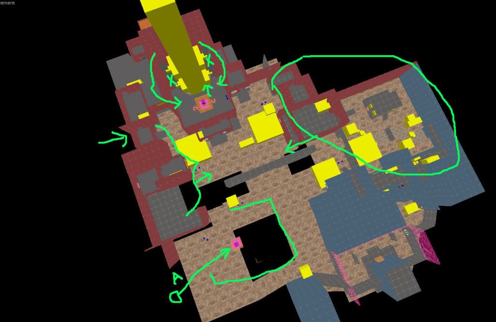
not going to list the changes, but here are some screens showing a little bit of detail and some changes.
NEW LINK major changes.
http://dl.dropbox.com/u/15441325/cp_original_a9.bsp.bz2
===========
a6
thought a5 was final layout... well
Moved B a little closer to C.
Rotated entire C structure 45*, put it closer to A, got rid of some paths between C and A.
some optimizing.
Put A back inside, re arranged the A area. Redid paths from Blu to A.
Remeasured times with pyro on a bunch of Gravelpit styles maps (GP, FC, ST...)
Times are now <=20 seconds walking for pyro, spot on with Gravel Pit.
Except when A+B capped C door opens giving Blu 20 seconds to C (instead of 30-40 from spawn). Hoping this will help them fight into C since it is more enclosed and probably easier to defend than C on GP.
===========
a5
pulled A in closer to middle.
shrank a few rooms here and there.
==========
a4 changelog : blame Beetle
Beetle mentioned that the map didn't have enough height change. I felt like he was right.
Point A was boring and I wasn't sure what I was doing with it's 'theme'.
So it's now a dock area, with a switchback cliff pathway down from C gate.
Both teams have high ground on their side of it, and the ocean under docks is a death pit.
Moved Blu spawn up a little bit, so less uphill battle to point B, and high ground for A.
==========
a3 changelog:
a3
Point C:
Enlarged fighting area.
Simplified paths from Red spawn
moved Red spawn a little closer.
Point B:
Moved a little closer to C.
changed pathways from B to C.
Placed temporary B building for model scale.
Point A:
Completely redone, moved a lot closer to Blu Spawn
Reduced sight lines
Added/Changed paths from Blu Spawn to A
Shortened path from Red spawn to A
Moved A outside (still figuring out how this point is going to be.
Made a/b to C gate a lot smaller.
=============
I'm gonna try and get Captain to run it when peeps are on the server, don't hate me.
It's a Gravel Pit style set-up, the A>B tunnel is more open and when A & B are capped a door opens between the to C.
It's all lit, everything works properly, there's ammo health all over, and it's well marked, finding your way should be easy enough.
It's almost exactly the same size as Gravel Pit, times are all the same, etc... so it SHOULD play pretty good.
Remember, I need you to win!
feedback here would be great, or if I get a demo recorded...[/b]
Last edited by Original on 02 Feb 2011, 10:20, edited 12 times in total.
This would be worth money if you had it in writing
- Egonny
- •cC• Member
- Posts: 286
- Joined: 10 Jul 2010, 02:26
- Steam ID: STEAM_0:0:18190371
- Location: Belgium
Re: CP_Original (working title) - need feed back PLEASE
Screenshots? Sorry, I'm lazy.
- the asylum
- Posts: 186
- Joined: 10 May 2010, 03:39
- Steam ID: STEAM_0:0:17799965
Re: CP_Original (working title) - need feed back PLEASE
me tooEgonny wrote:Screenshots? Sorry, I'm lazy.
- PhrozenFlame
- •cC• Member
- Posts: 2307
- Joined: 13 May 2009, 07:04
- Steam ID: STEAM_0:0:21842434
- Twitter Username: GiroTheHero
- Location: Desoto, TX
Re: CP_Original (working title) - need feed back PLEASE
I'll probably be not lazy for once in my life and check it out in-game, though I can't get any actual gameplay at the moment due to my terrible internet connection for now. I'll just look around for health and ammo packs and see if there's enough cover for an Attack/Defend map.
Drop the whole thing into Team Fortress 2>TF>Maps, right? Haven't installed a map manually in ages.
Life is whatever.
Re: CP_Original (working title) - need feed back PLEASE
OK, added an overhead shot. Not much to look at but it gives you an idea of paths and layout.
Not going to do any detail work until I'm satisfied it plays well, too much work to redo otherwise.
Unzip it and put it into steamapps/username/TeamFortress2/tf/maps, then start game, go to console and type
map cp_original_a1
Or you can do it with a server, left in the zip file, but it's been awhile, I forgot where that goes.
This would be worth money if you had it in writing
- captainAngry
- •cC• Founder
- Posts: 2615
- Joined: 04 Dec 2008, 05:32
- Steam ID: STEAM_0:0:18403615
- Twitter Username: calcchaos
- Xbox Gamer Tag: RemainingCoast
- Location: Minneapolis, MN
- Contact:
Re: CP_Original (working title) - need feed back PLEASE
I added the map to both servers so people can check it out.
-captain
-captain
Re: CP_Original (working title) - need feed back PLEASE
tx
This would be worth money if you had it in writing
- Beetle
- •cC• Member
- Posts: 2243
- Joined: 28 Dec 2008, 01:33
- Steam ID: STEAM_0:1:2945765
- Location: North Carolina
Re: CP_Original (working title) - need feed back PLEASE
never been to tx.
Click Here to go to my Mapping Blog.
Re: CP_Original (working title) - need feed back PLEASE
I wouldn't recommend EVER going to Tx. I just like to promote it.
This would be worth money if you had it in writing
- the asylum
- Posts: 186
- Joined: 10 May 2010, 03:39
- Steam ID: STEAM_0:0:17799965
Re: CP_Original (working title) - need feed back PLEASE
I think it's waaaaaaaaaaaaaay to big for a gravelpit-like map, and there's not enough tight spaces for Pyros and Heavies
Re: CP_Original (working title) - need feed back PLEASE
Thanks for the feedback.
I actually pulled a spawn point for both red/blu AND A,B,C cap points directly from gravel pit and aligned mine with them (with a little lienency involved). But they are all within a sec of walk distance for scout of GP's points. (but C isn't 3 floors up)
There are some changes i think that need made already though and the lack of tight spots is deffinately one of them.
I also wouldn't mind it being a hair smaller than GP so it's a little better for less than full servers, but go too small it'll be cramped... If I wanna sell it to Valve I can't stray to far from what works.
I think the entire area B is going to slide towards C a few units. I want to expand the area in front of C building forward and make the C cap area inside a bit more open. (Just that damn huge rocket that takes all the room)
And I want A to be more open/exposed to elements I think. Feels cramped to me. That red building in the middle in front of A is gonna slide to right next to the blu building and pinch that in, leaving room to fight in front of A.
I think I'll also tighten up the outside 'tunnels', they feel way more wide open than GP's tunnels.
I think I got too far away from GP's 3 wide open fight zones with tight tunnels in between and it makes it feel more like a 5 point CP in some spots.
This would be worth money if you had it in writing
Re: CP_Original (working title) - need feed back PLEASE
thanks to everyone for playing through tonight.
I've made some major changes throughout the day and hopefully will have a new version out by the end of the weekend that should address most of the major issues.
Then hopefully some small issue/tweak tests, proper placement of ammo/health and whatnot, then detailing.
I don't like looking at dev tex any more than anyone else
pic of changes made, probably about 25% smaller now.
This would be worth money if you had it in writing
Re: CP_Original (working title) - need feed back PLEASE
New version up, major changes. Hopefully close to final layout now.
http://dl.dropbox.com/u/15441325/cp_original_a3.bsp.bz2
This would be worth money if you had it in writing
- Beetle
- •cC• Member
- Posts: 2243
- Joined: 28 Dec 2008, 01:33
- Steam ID: STEAM_0:1:2945765
- Location: North Carolina
Re: CP_Original (working title) - need feed back PLEASE
Pretend this was posted before you just posted that version.
For one, I suck at giving feedback, but any feedback is better than none. I feel like the first layout was too open. I love maps with a lot of height variation, and except for cap C, you could not really take advantage of the different heights available in my opinion.
^all related to the old layout. I'll test the new one when we play it on the server and im there.
Click Here to go to my Mapping Blog.
Re: CP_Original (working title) - need feed back PLEASE
thanks. Yeah it's about 30% smaller than the first now.
Not a lot of height variation for sure. In face A is kindof flat and I'm thinking if any more major changes are done it needs to be height at A. Not sure what to put there yet, but maybe docks would be a good excuse for lower elevation (thus making B a little higher and C the highest).
hmm, docks... yes.
This would be worth money if you had it in writing
- Beetle
- •cC• Member
- Posts: 2243
- Joined: 28 Dec 2008, 01:33
- Steam ID: STEAM_0:1:2945765
- Location: North Carolina
Re: CP_Original (working title) - need feed back PLEASE
I think a perfect example of height variation of what i like is right before that first turn on cashworks. know which one i mean?
Click Here to go to my Mapping Blog.
Re: CP_Original (working title) - need feed back PLEASE
Yeah, I think if I did docks for A they'd only be a little lower than blu spawn, but probably about that much lower than C. So the C>A side would have a very big height change. Probably close to that part of cashworks.
---------
Looking like after playing today C is too easy for red to hold. Have to test more before I can say for sure, but I'm thinking of leaning towards faster spawns for blu after A/B are capped.
More fun to speed up the game, than slow it down with longer spawn for Red I think.
---------
Looking like after playing today C is too easy for red to hold. Have to test more before I can say for sure, but I'm thinking of leaning towards faster spawns for blu after A/B are capped.
More fun to speed up the game, than slow it down with longer spawn for Red I think.
This would be worth money if you had it in writing
Re: CP_Original = updated to A6 Jan 20
a9 is released.
This would be worth money if you had it in writing