Page 1 of 1
New Site design mockup
Posted: 09 Mar 2009, 04:32
by captainAngry
I have been thinking about redesigning the forum and have been playing around with a few design ideas. I worked on fleshing one out today and would like to show you guys what I have come up with. I havn't chosen a font yet and I am not sure exactly what I want to do with the actual forum part but the image should give you an idea of what I am thinking about.
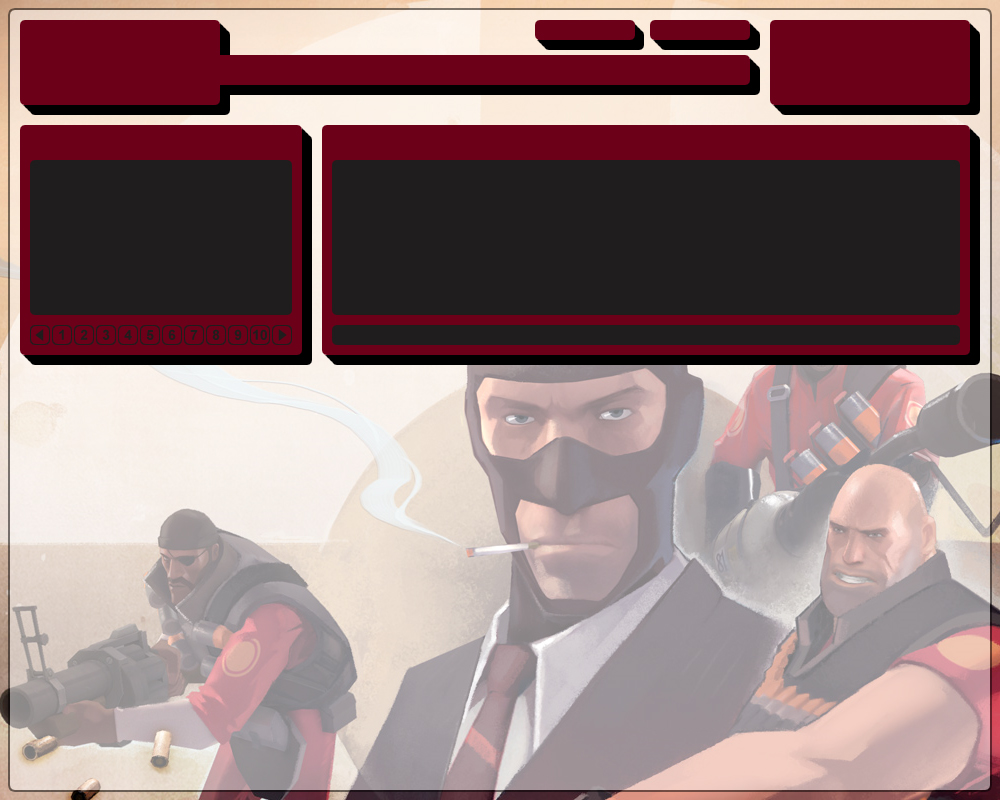
- newGaming.jpg (276.31 KiB) Viewed 5099 times
http://gaming.calculatedchaos.com/demo/
The top left is for the logo.
The top right is for a map ratings module that shows some stats about maps we have rated.
The buttons on the top are for the donate button and a widget to show the current map list.
The bar on the top is for the text menu of the forum.
Below that, the left module is for announcements which would include an image represented by the grey box.
The right module is for the shoutbox.
The design is meant to be a fixed width at 980px wide (the white box). This isn't set in stone and could change during implimentation.
That's all I got.
-Captain
Re: New Site design mockup
Posted: 09 Mar 2009, 08:49
by MrKerplunkers
Is looking very nice capt.
Re: New Site design mockup
Posted: 09 Mar 2009, 09:14
by Liquid Death
I'm liking it
Re: New Site design mockup
Posted: 09 Mar 2009, 10:25
by Awesomesauce
Meh, i don't like it so much Captain. I like coming to the forums to read threads, not to look at TF2.
But other then that, nice design.
Re: New Site design mockup
Posted: 09 Mar 2009, 10:52
by captainAngry
The forum part of the forum isn't on that mockup.
The TF2 picture will be barely visible in the background unless you have a wide-screen monitor, in which case it will fill your whole screen.
Re: New Site design mockup
Posted: 09 Mar 2009, 11:03
by Riftoff
The maroon looks a little too pink. Make it a little less rich and more subdued, like faded Communist propaganda that seems to be all the rage these days.

Re: New Site design mockup
Posted: 10 Mar 2009, 07:21
by captainAngry
It's hard to judge the color since it looks extra pink compared to the red on the site now. If I go with this design, when I actually start making it I will make sure the colors work.
Re: New Site design mockup
Posted: 10 Mar 2009, 11:55
by HurTmePlentY
the tf2 content boxes look pretty sweet.
Re: New Site design mockup
Posted: 10 Mar 2009, 01:48
by g_e_oos
While I like this one I think everyone who knows how should submit something and we vote.
Re: New Site design mockup
Posted: 10 Mar 2009, 02:29
by Awesomesauce
Alright then, I LOVE IT.
Re: New Site design mockup
Posted: 10 Mar 2009, 04:19
by captainAngry
I made a more actual website demo so people can get a better understanding of what the site would actually look like.
You can find it here:
http://gaming.calculatedchaos.com/demo/
Re: New Site design mockup
Posted: 11 Mar 2009, 03:02
by Beetle
ouch. white text on white background
Re: New Site design mockup
Posted: 11 Mar 2009, 03:15
by captainAngry
Boo. I wasn't going to bother fixing it because I figured it was obvious that it wouldn't be there when the site was built. I'll remove it now.
Re: New Site design mockup
Posted: 11 Mar 2009, 04:10
by Hanzo_blade
I like this design and everything captain but I think it needs more Calculated Chaos in it.
Not saying you have to use this or anything, I just quickly made it so I could get my idea across. The background should have those sweet CC logo's or something.
Re: New Site design mockup
Posted: 11 Mar 2009, 08:21
by MrKerplunkers
Re: New Site design mockup
Posted: 11 Mar 2009, 11:06
by captainAngry
Hanzo_blade wrote:I like this design and everything captain but I think it needs more Calculated Chaos in it.
Not saying you have to use this or anything, I just quickly made it so I could get my idea across. The background should have those sweet CC logo's or something.
The background will be random. I was thinking of starting with all the backgrounds they have in game.
The problem is that image needs to be pretty big. My monitor at home is 1680 x 1050. The image I am using now is 1280px wide which scales pretty well. It just looks better if the image is getting scaled down. The white overlay hides it a bit.
Anyway, in all honesty the new design probably won't happen for a long time. I haven't even designed what I want the forum part of the forum to look like.
Re: New Site design mockup
Posted: 13 Mar 2009, 03:50
by Altair the spy
Hanzo_blade wrote:I like this design and everything captain but I think it needs more Calculated Chaos in it.
Not saying you have to use this or anything, I just quickly made it so I could get my idea across. The background should have those sweet CC logo's or something.
bup bup bup bup i'm lovin it


Re: New Site design mockup
Posted: 17 Mar 2009, 02:09
by captainAngry
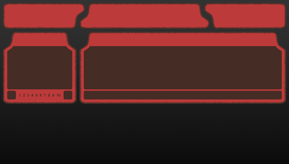
- newGamingRedTest.png (175.53 KiB) Viewed 4925 times
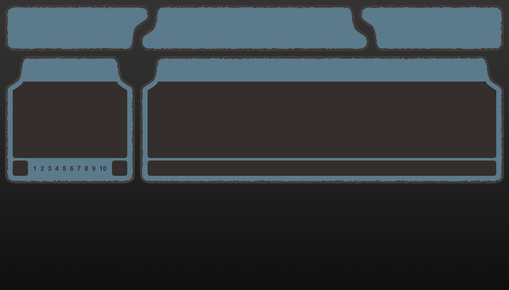
- newGamingBlueTest.png (172.13 KiB) Viewed 4924 times
I came up with a new design idea and wanted to try it out. A lot of things aren't worked on on this version but, since I am using valve colors, I should be able to make a red and blue version to give people options without too much color picking on my part.
Re: New Site design mockup
Posted: 20 Mar 2009, 11:40
by Awesomesauce
I like the Blue better.